New climate ‘stripes’ reveal how much hotter your hometown has gotten in the past century
 |
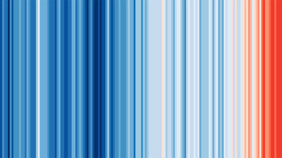
| Image showing the stripes since 1850 to present |
A social media campaign called ShowYourStripes (you can see your region's temperature stripes) provides valuable information to the science community with blue and red barcode-like striped images.
These images are nothing but the temperature distribution of a region over a century.
Climate scientist Ed Hawkins at the University of Reading in the United Kingdom created the "warming stripes", which use bands of color to indicate warming or cooling temperatures from 1901 to 2018, last year.
Climate scientist Ed Hawkins at the University of Reading in the United Kingdom created the "warming stripes", which use bands of color to indicate warming or cooling temperatures from 1901 to 2018, last year.


Comments
Post a Comment